- Get link
- X
- Other Apps
text-shadow
The text-shadow Property adds shadow to the text. You can set the text-shadow property of text,if you desire to display shadow to highlight your text.
It's values:
The text-shadow property takes six values as follows:- h(horizontal) direction : it defines the distance of the shadow form text in horizontal direction.
- v(vertical) direction : it defines the distance of the shadow from text in
vertical direction.There is nothing to do with the names h and v, we can also name it as x and y.To makes it easy to remember I chose the name h for horizontal and v for vertical direction.
- blur : It gives a blur effect to shadow, without blur effect shadow will not look attractive. It is optional to use blur value.
- color: it specify the color of the shadow.
- initial: initial sets the text-shadow property to default value (0).
- none: none means there will be no shadow effect on the text.
Syntax: text-shadow: h_value y_value blur_value color_value; OR text-shadow:none/initial;
Negative values:-
Negative values are also supported .We can use negative values to move shadow in opposite direction.It supports the units as px,pt,em,cm,in(inch),pc(pica) etc.
Note: color_value can be written at first or last position. To give values px,pt,em,cm,in,pc units can be used.To specify color value , any color format can be used like RGB,Hexadecimal,CMYK,RGBA etc.
Example: This example will illustrate all the values of text-shadow effect, Also I'll try to make you understand the effects of blur value.In this example,I'll use Embedded CSS,Code:
<html>
<head><title>CSS text-shadow Property</title>
<style>
h6.shadowwithBlur{
color:black;
text-shadow: 5px 2px 4px red;
}
h6.shadowWithoutBlur{
color:black;
text-shadow: 5px 2px red;
}
h6.colorinHexaatFirst{
color:black;
text-shadow: #bc5394 5px 2px 4px;
}
h6.valuesChange{
color:black;
text-shadow: 10px 5px 5px red;
}
h6.none{
color:black;
text-shadow: none;
}
h6.initial{
color:black;
text-shadow: initial;
}
h6.rgbaAndNegativeValues{
color:black;
text-shadow: rgba(0,0,255,0.5) -1px -2px 0.5em;}
</style>
</head>
<body>
<h6 class="shadowwithBlur">text-shadow with Blur Effect</h6>
<h6 class="shadowwithoutBlur">text-shadow without Blur Effect</h6>
<h6 class="colorinHexaatFirst">text-shadow color value in hexadecimal format & color at first position</h6>
<h6 class="valuesChange">text-shadow values changed</h6>
<h6 class="none">text-shadow with none value</h16>
<h6 class="initial">text-shadow with initial value</h6>
<h6 class="rgbaAndNegativeValues">text-shadow using rgba color format and negative values.</h6>
</body>
</html>
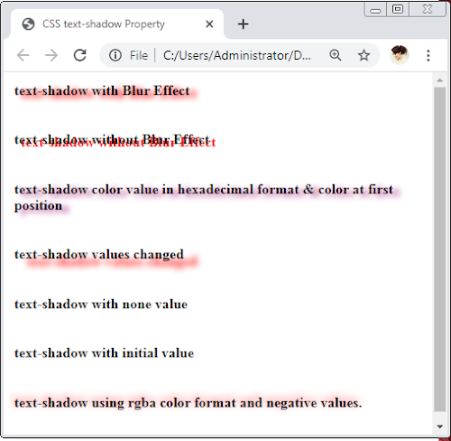
Result:
- In the first heading we used normal values,
- in second there is no blur effect,
- in third color format is Hexadecimal and placed at first position,
- in fourth we changed the values of h and v that caused shadow to be at lower side of text,
- none means no shadow,
- initial means default shadow which is 0,
- In the last heading,we used RGBA(0-255,0-225,0-255,0/1) color format ,here RGB is same as RGB format but A stands for Alpha which decides transparency of shadow.It can have value form 0.0(fully transparent) to 1.0(fully opaque). I have used 0.5 in above example.
Can we add more than one shadow to a text?
Yes,We can add as many as shadow we want. We can do this by using same text-shadow property and write its values for each shadow by separating them with comma(,).
Syntax: text-shadow: values1 , values2, ...., valuesn; We can specify shadow up to n numbers and we need to place values for each shadow after comma(,).
Example:-This example will illustrate the use of 2 shadows on same heading.
Code:
<html>
<head><title>CSS text-shadow Property</title>
<style>
h1.twoshadows{
color:black;
text-shadow: 5px 2px 4px red , 10px 4px 5px blue;
</style>
</head>
<body>
<h1 class="twoshadows">text with two shadows</h1>
</body>
</html>
I hope you have enjoyed this post.Experiment with the shadows to explore more about them.Keep practicing! Happy Coding!


Comments
Post a Comment
If you have any doubt, ask here